The brief:
carlos has decided to open up a coffee roasters in chile, following on from his recent breakthrough of growing and roasting coffee in chile - something that has previously been near impossible due to chile's climate and elevation levels. he feels the recipe is ready to be shown to the world and enjoyed with pride.
Carlos' coffee promotes an alternative to consumers across chile and worldwide, with chilean consumers having access to locally sourced coffee rather than western imported goods and the coffee-lovers of the world can enjoy this new type of coffee bean.
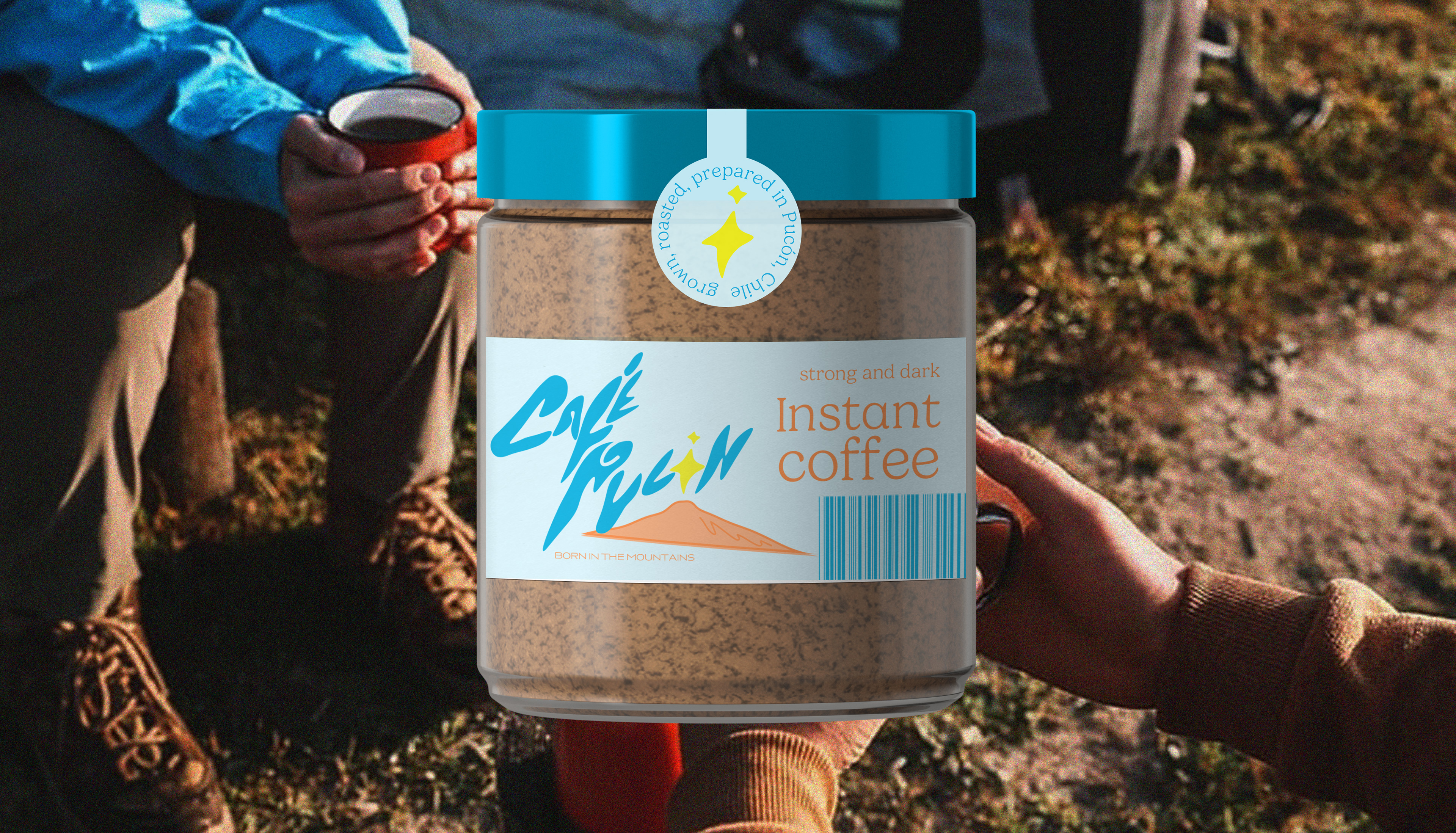
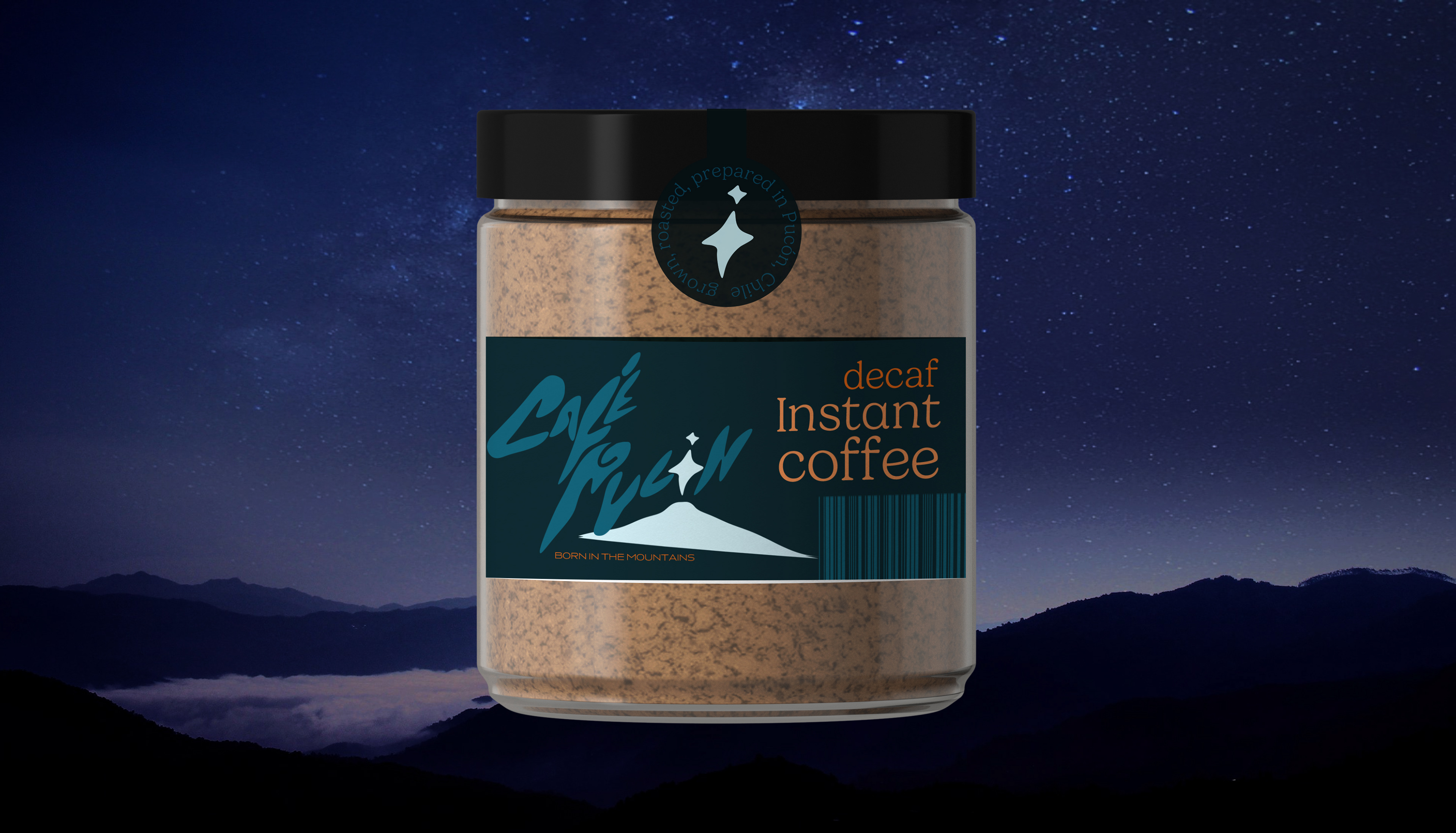
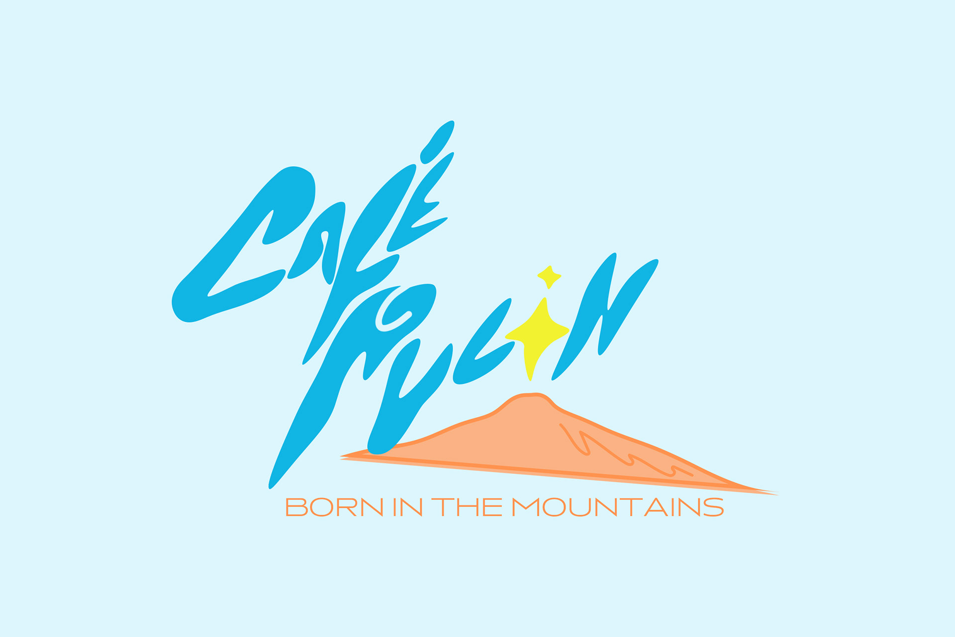
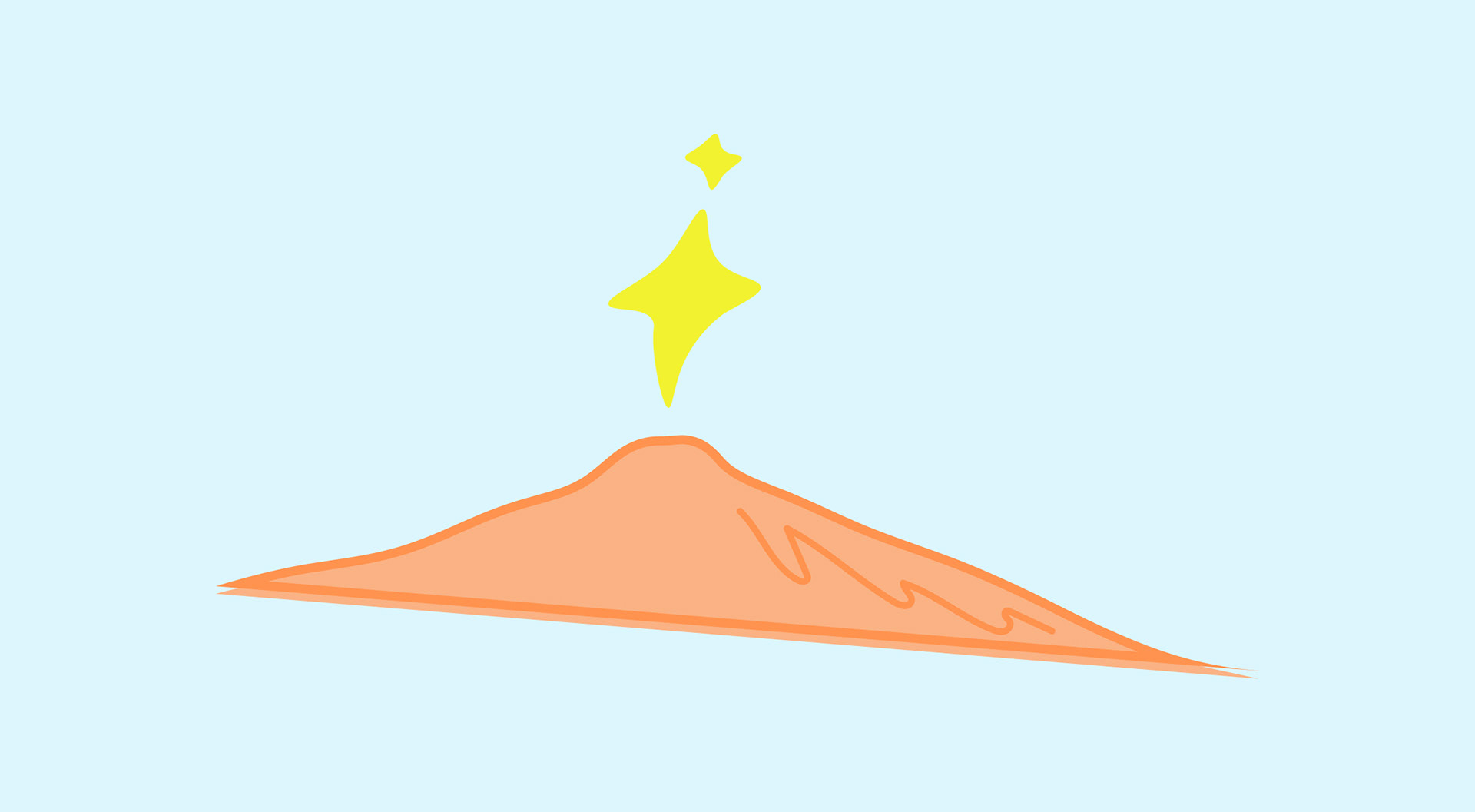
carlos is from the city of pucon, chile which contains a natural wonder: a live volcano known as villarrica. he's named the brand after his home and wants the visuals to communicate how special this breakthrough is. after all, this isn't just any regular coffee, it is indeed a natural wonder.
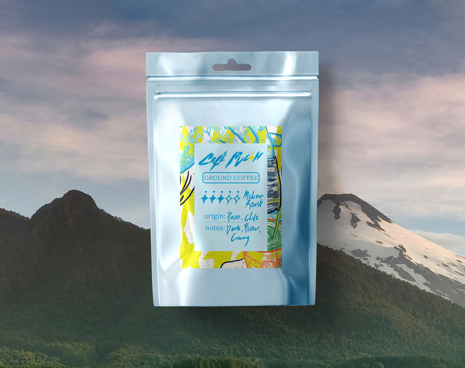
He will be releasing ground coffee and an instant version to make the coffee accessible, especially for those in chile who dominantly drink instant coffee brands like nescafe and don't have access to the kit most western consumers do. Packaging will be required for both.
the insight:
Cafe pucon is a breakthrough in chilean agriculture and should be something to shout about. this branding needs to be bold in approach and stand proud against western competitors.

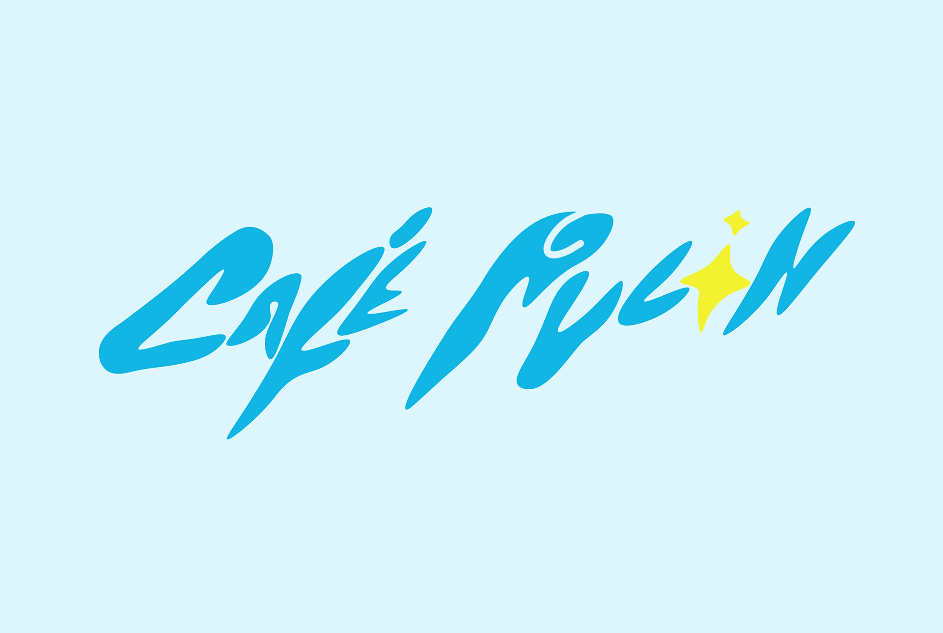
the logo for this brand is a hand-drawn typeface that's sleek and commands attention. the star symbol for the letter 'o' adds aesthetic value and mimics a lava eruption from the volcano situated below. it's bold and it's not afraid. This coffee is the first of its kind and should enter the market with a bang.
the typeface has this fluidity to it that simulates spilt coffee, there's action to it that's sudden and abrupt, contributing to the boldness the client wanted and its break into the coffee scene.
the inclusion of villarrica as the brand's illustration balances the logo visually and cements the proud tone of the brand. cafe pucon is the first of its kind and something to evoke wonder.
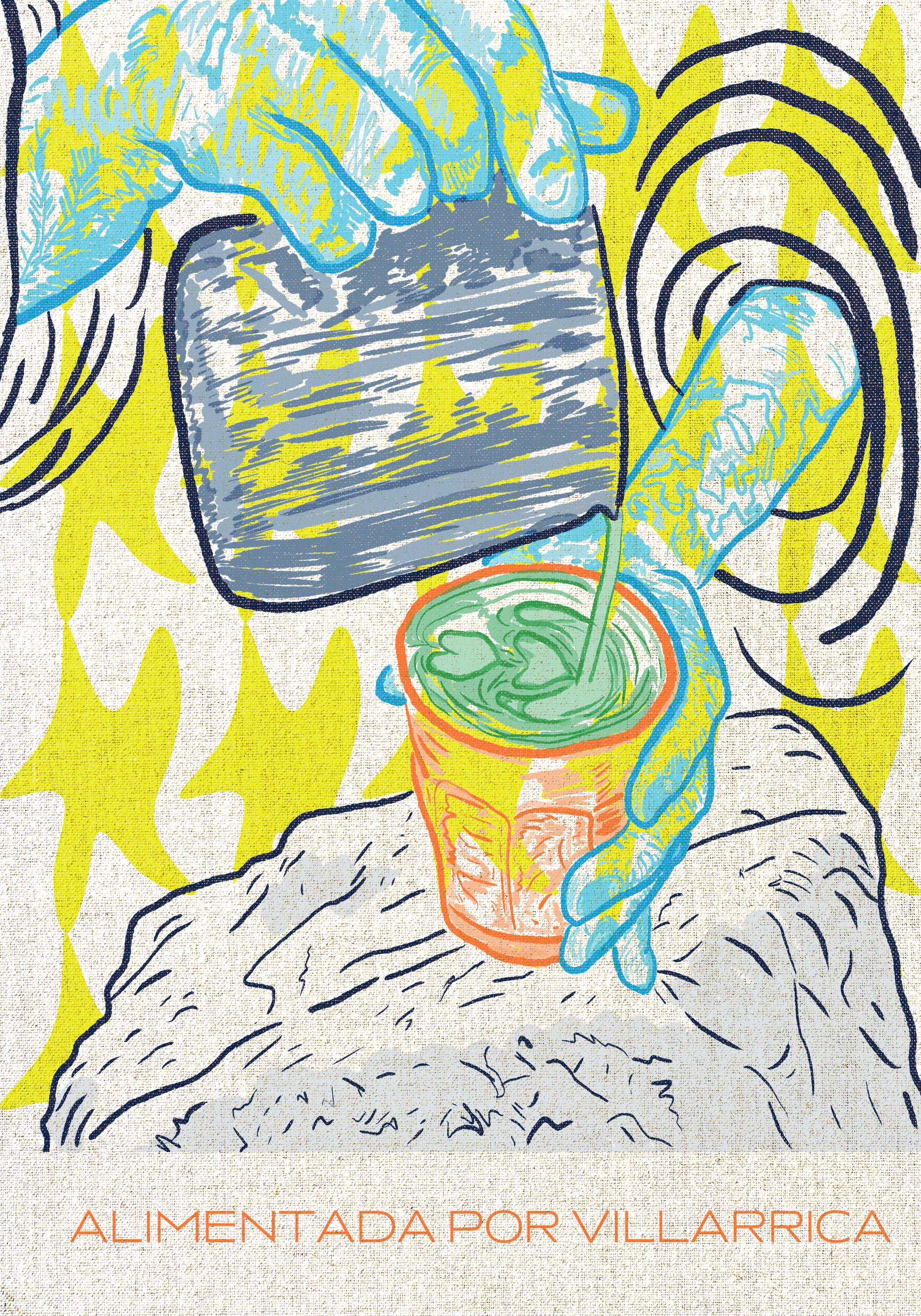
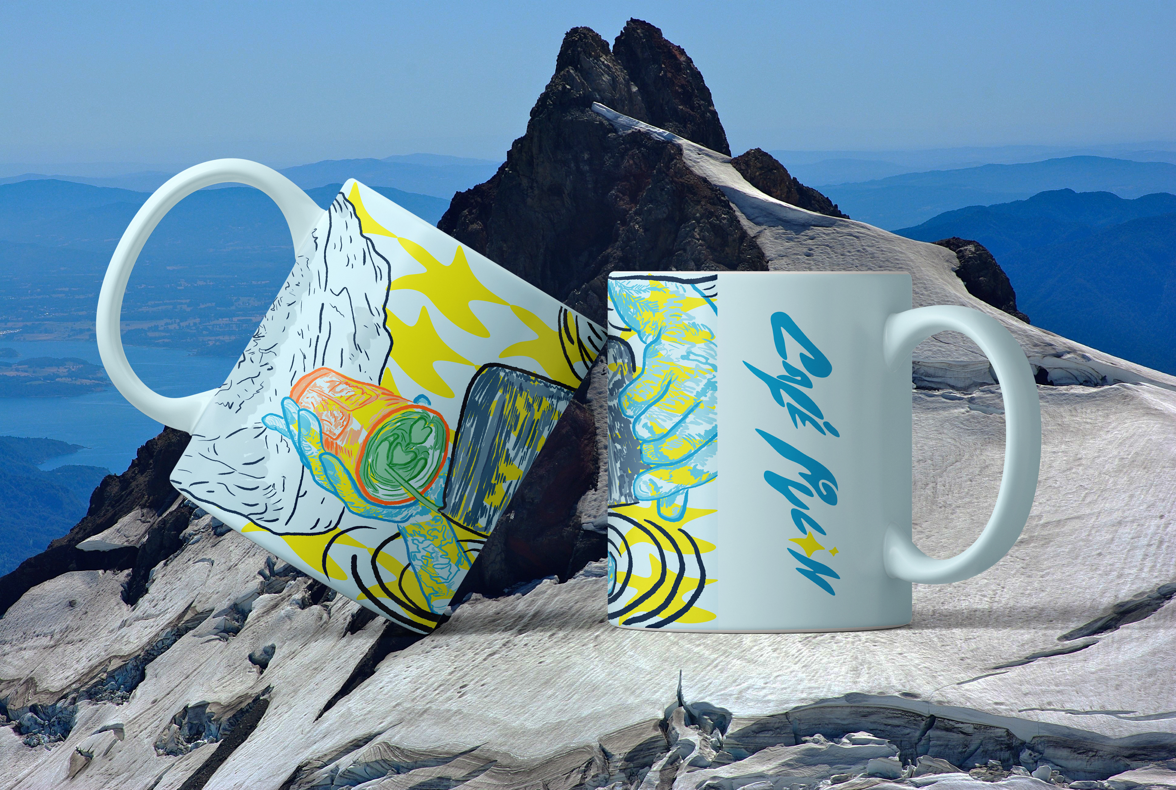
the illustration below depicts a 'mother nature' figure making the coffee herself on top of a mountain cliff, playing with the 'natural wonder' side of this brand to create a vivid visual for merch and a backdrop for labelling.
this illustration is layered on the ground coffee packaging