The Brief:
Matteo has lived in Sicily since he was born and runs a family business with Sicilian lemons. He wants to market his lemons worldwide, but is still looking for the right brand identity. It needs a logo with variations and packaging materials and whatever else you want to design.
THE INSIGHT:
SICILIAN LEMONS ARE ALL ABOUT THE EXPERIENCE. LEMON FARMS ATTRACT TOURISTS FROM ALL OVER THE WORLD TO COOK, TASTE AND DISCOVER. IT'S RICH IN AGRICULTURAL HISTORY AND IS EMBRACED BY THE LOCALS TO SHARE WITH THE REST OF THE WORLD. THIS IS ABOUT COMMUNITY AND APPRECIATION, ALLOWING US TO SLOW DOWN AND ADMIRE OUR SURROUNDINGS.
THE IDEA:
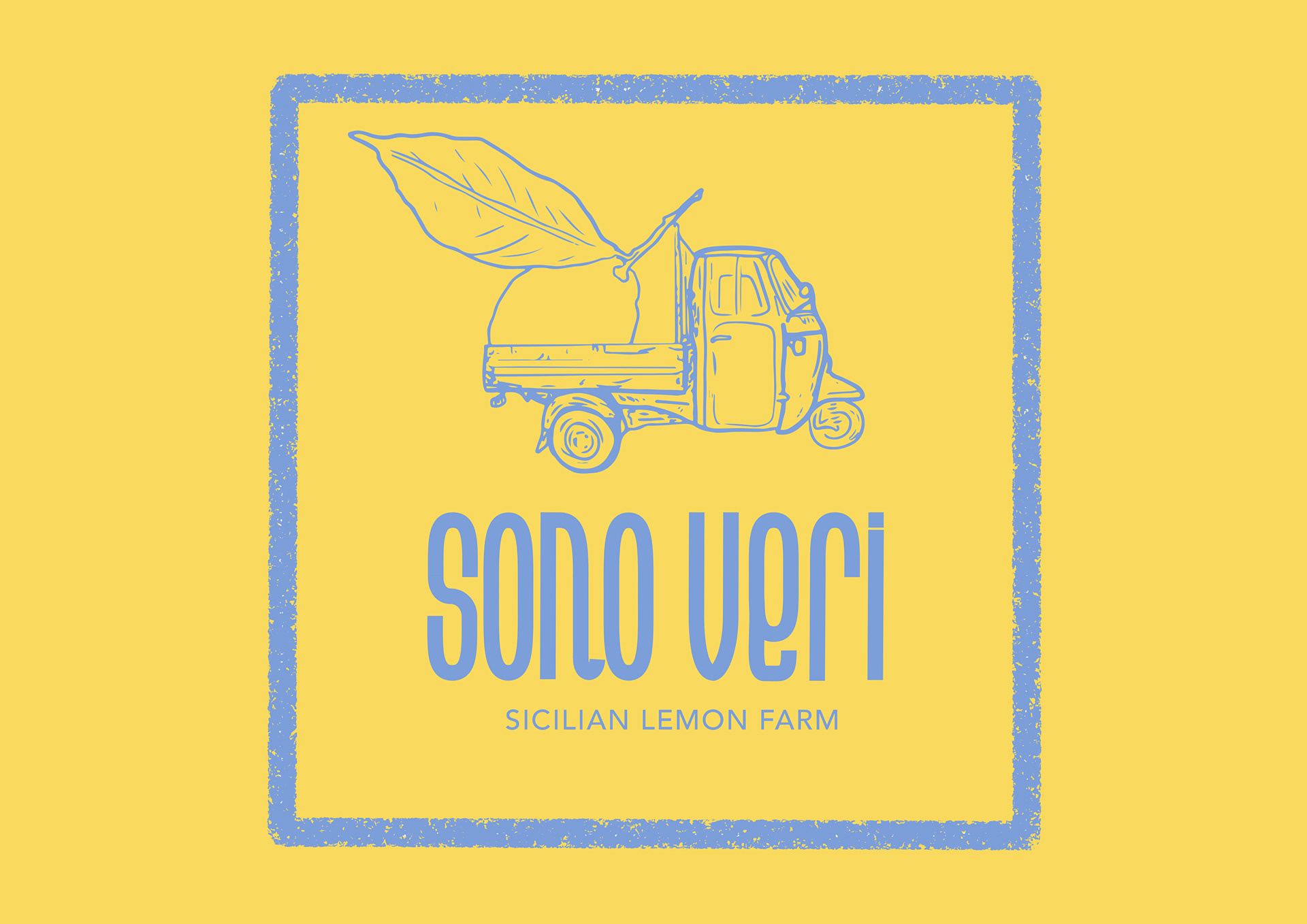
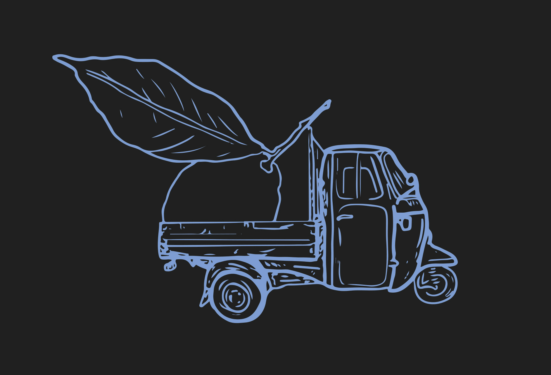
THE BRAND SHOULD FEEL FAMILIAR AND WELCOMING, INLINE WITH THE FAMILY FOCUS OF THE BUSINESS AND ITS LONG HISTORY. THIS IS COMMUNICATED BY THE SOFT GRAINY IMAGERY AND RUSTIC FEEL TO THE ILLUSTRATION, USING A COARSE MARKER TO SKETCH.
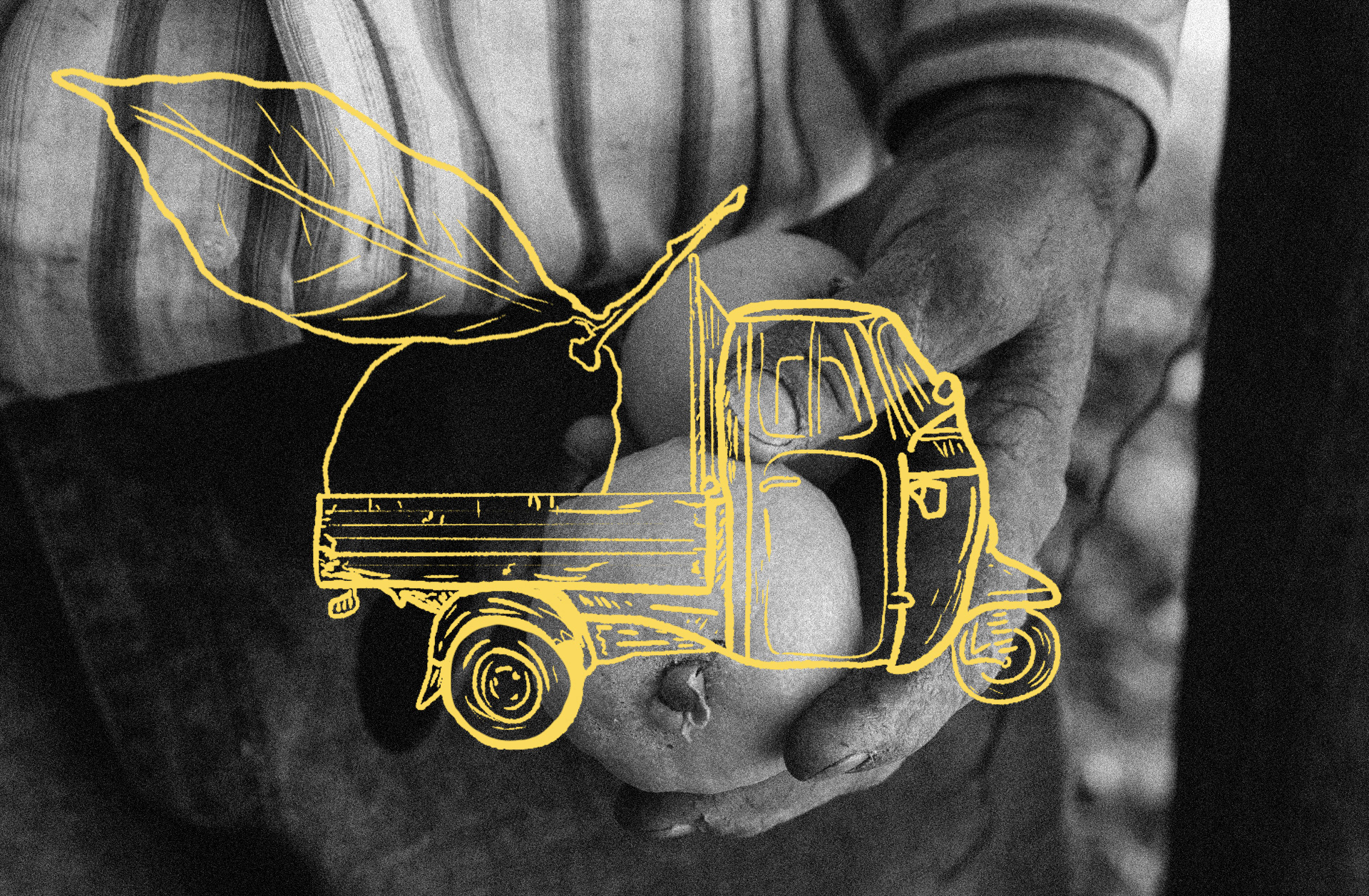
THE THREE-WHEELED FARM TRUCK IS SOMETHING RATHER UNIQUE TO ITALIAN AGRICULTURE, so much so that it has become iconic. known as the 'piaggio ape', it has been in production since 1948 and remains a beloved symbol of Italian culture and a popular choice for various applications. As Matteo is wanting to take his business global, the truck felt like a strong symbol of the business roots and family-owned origin. it declares itself as proudly italian.
The oversized lemon reinstates the humble nature of the business. matteo has worked in the business his whole life and his parents before him. the illustration is playful yet displays purpose, displaying what they know best: lemons!
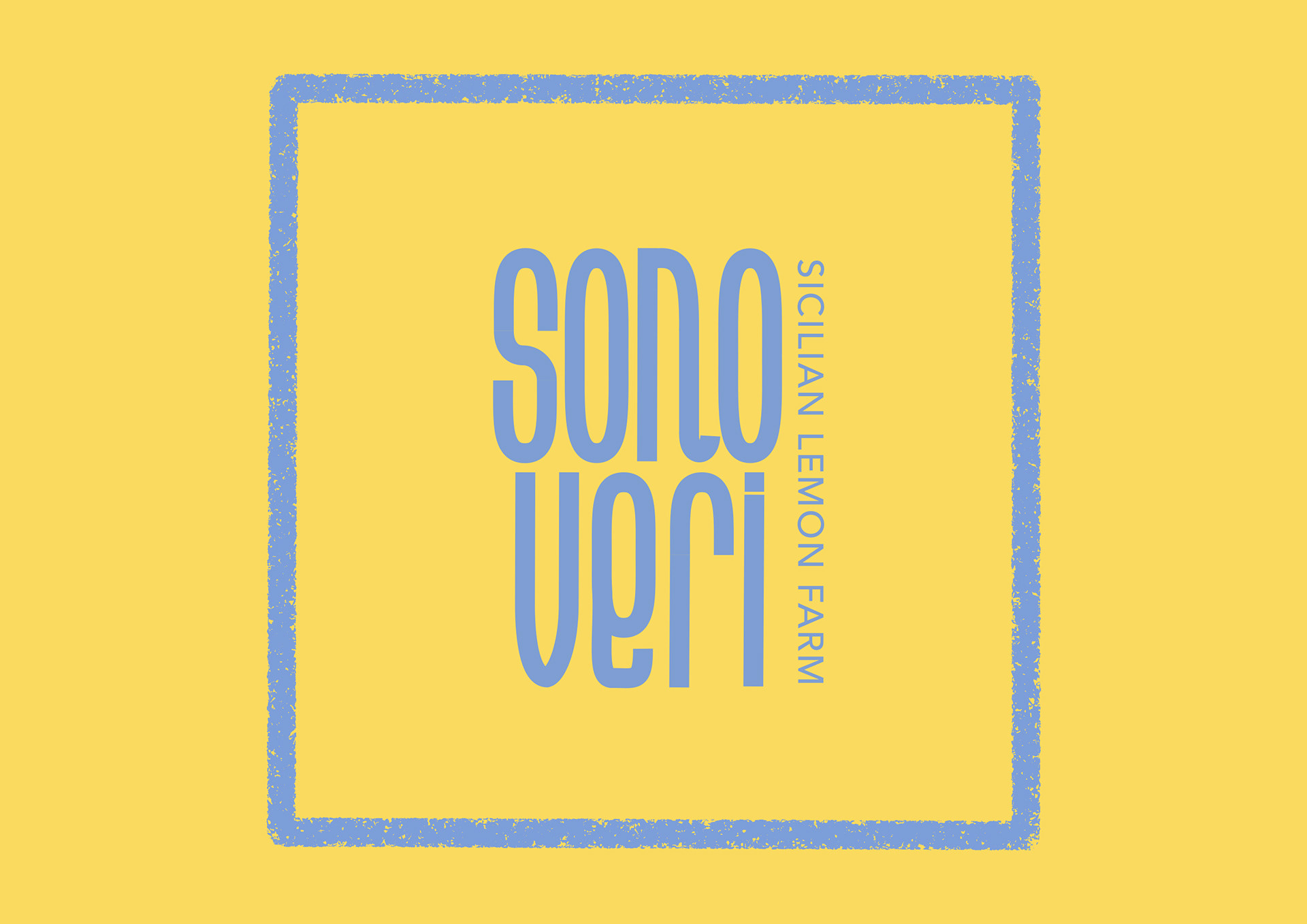
THE FONT FOR THE LOGO OF THE BUSINESS IS SLEEKER THAN ITS IMAGERY, BUT STILL HAS THIS FUN, PLAYFUL ENERGY TO IT ALLOWING US TO NOT VIEW THE BUSINESS AS "FORMAL" OR "SERIOUS", YET ENFORCES THIS FEELING OF FAMILIARITY AND FRIENDLINESS.
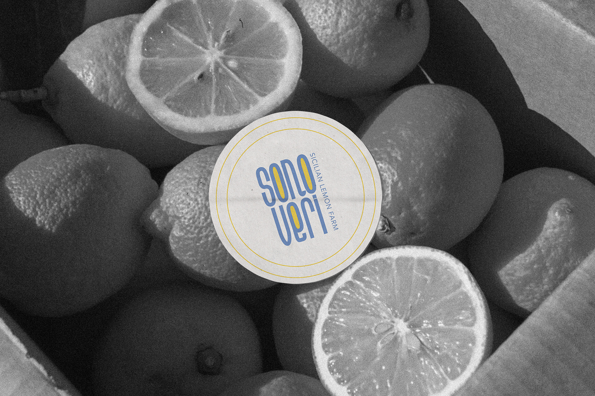

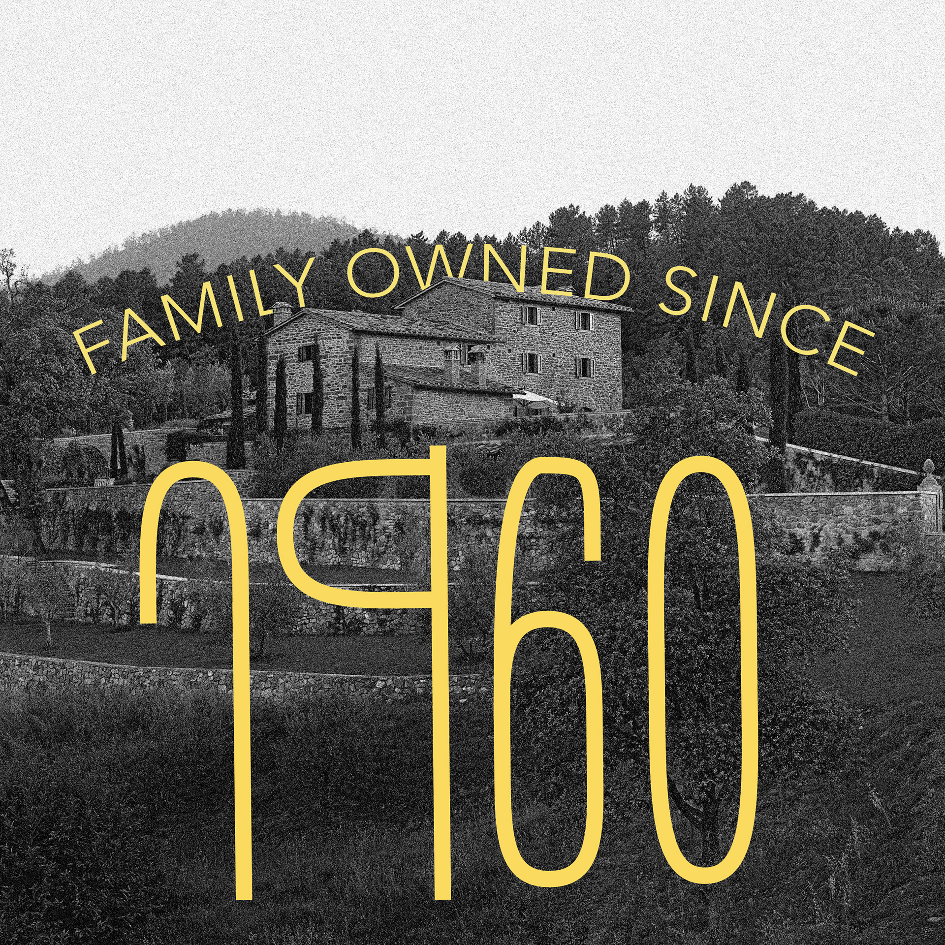
THE FONT IS ALSO INSPIRED BY CLASSIC 60'S ITALIAN TYPOGRAPHY, WHICH WAS INFLUENCED BY THE BUSINESS' FOUNDING YEAR - FURTHER CONTRIBUTING TO THE FAMILIARITY OF THE BRAND.
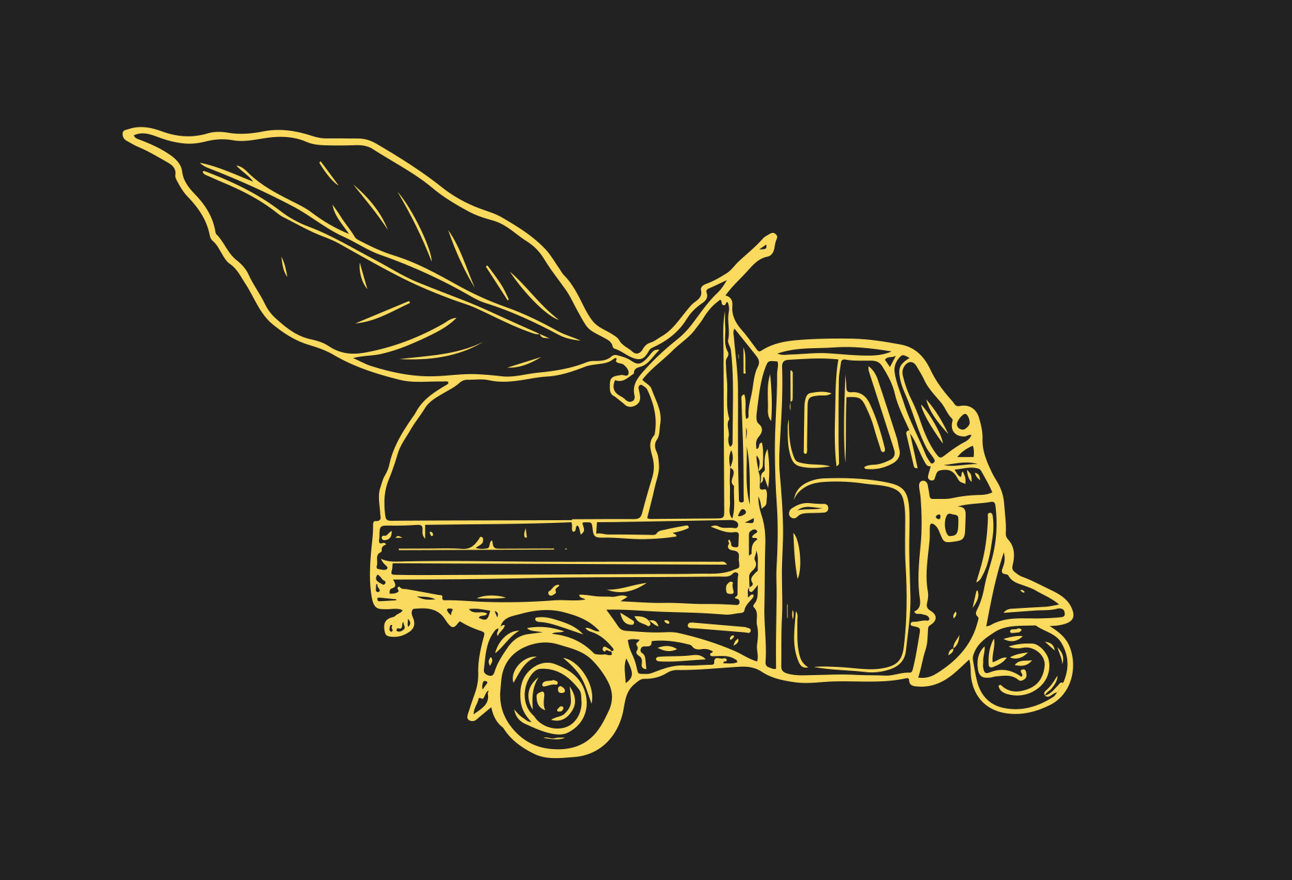
FOR THE COLOUR PALETTE, LEMON YELLOW HAD TO BE INCLUDED AS AN ESSENTIAL PART. ITALIAN LEMONS ARE KNOWN FOR THEIR BOLD COLOUR AND FLAVOUR AS WELL AS LARGER SIZE, SO THE COLOURS NEEDED TO REFLECT THIS IMPRESSION. THIS PASTEL, MUTED BLUE IN PAIR WITH THE YELLOW IS RESONANT OF SUMMER AND WARMER TIMES, WHICH WORKS TO REFLECT THE ORIGIN OF THE BUSINESS.